I see designers claiming they use Midjourney to create realistic portraits of people, so I gave it a try.
After generating over 200 images, here’s what I think:
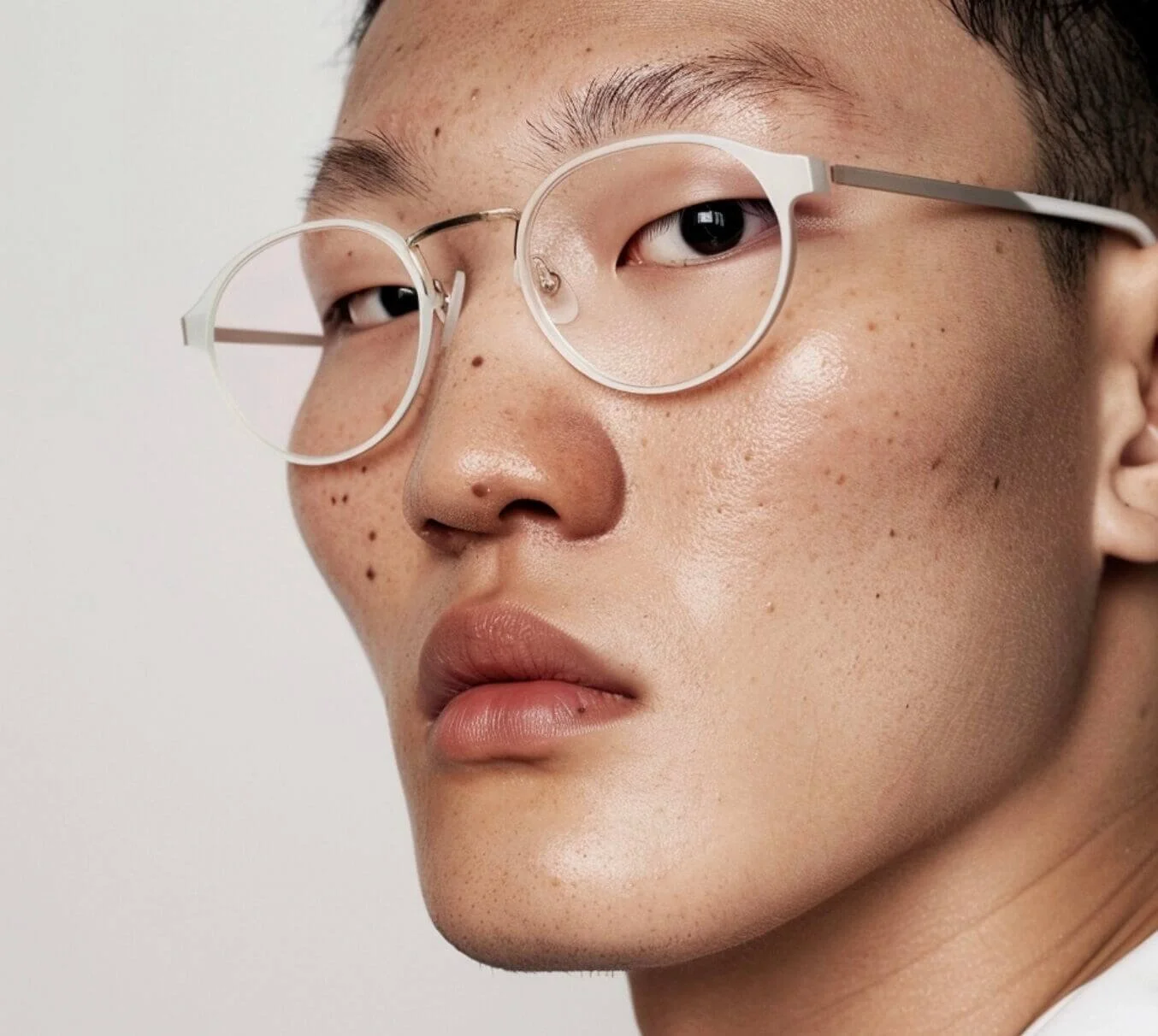
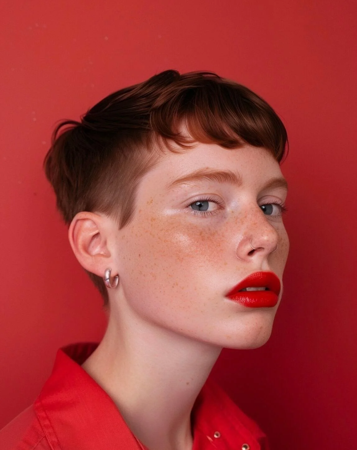
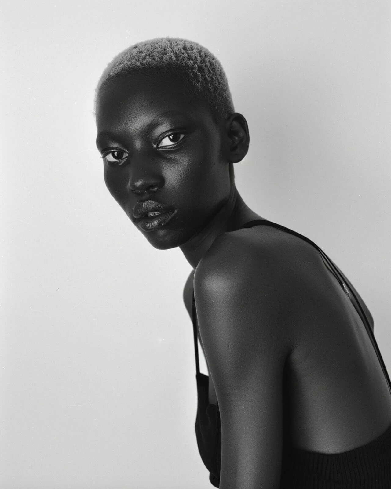
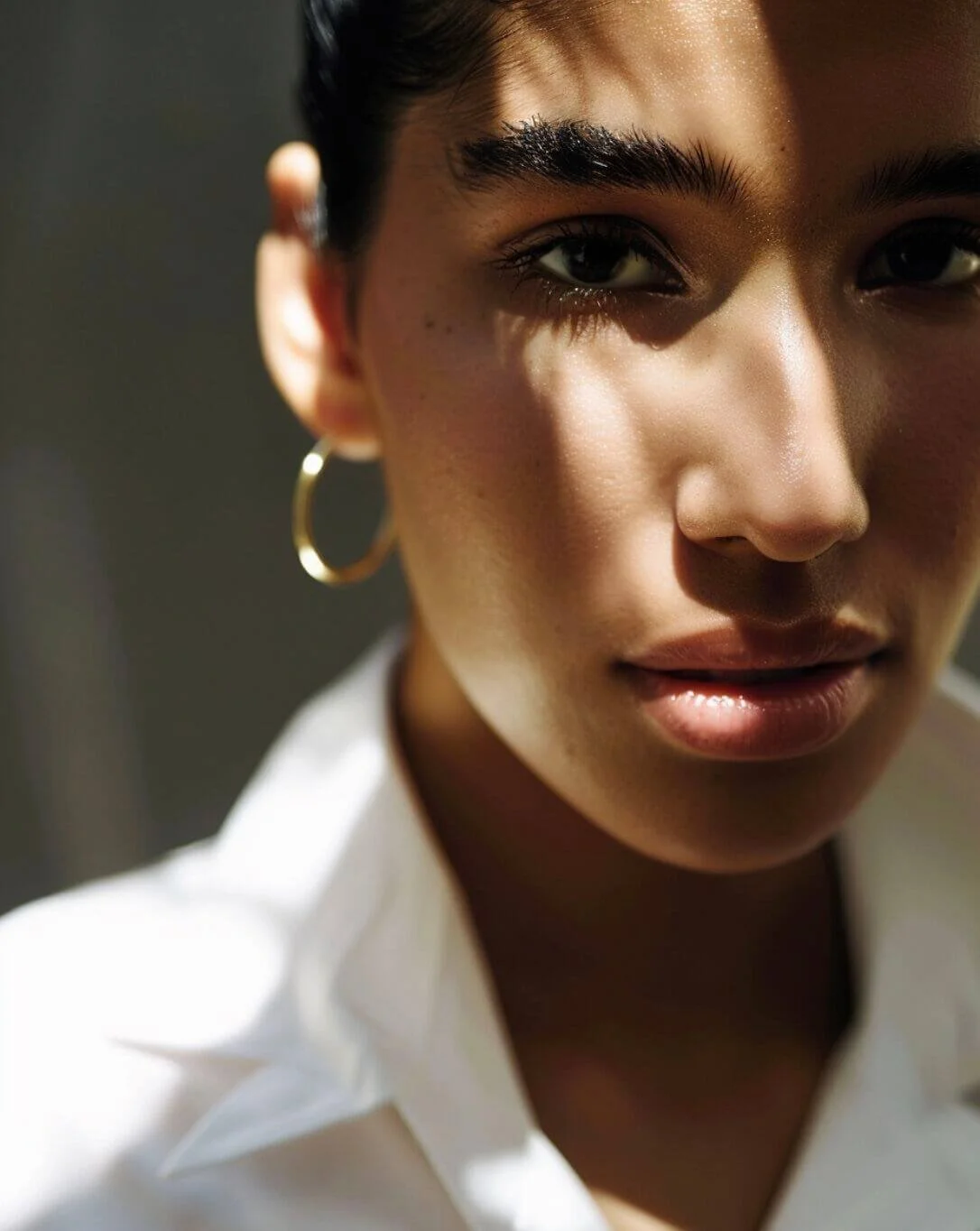
The convincing photos we see are heavily cherry-picked. I did get a few images that I’d feel comfortable using (posted here), but most still had that telltale AI glow.
Also, Midjourney thrives on randomness. That unpredictability makes it fun for exploration but frustrating if you’re trying to create a consistent visual style or cohesive brand photo series.
Still, here’s what helped me get closer to realism on Midjourney:
Prompting imperfections: bump on the nose, scar above right eyebrow, subtle pore texture, hooded eyelids. The things that make us unique and human.
Experimenting with weights: subtle crow’s feet ::0.5, gap in front teeth ::1.2
Weights tell Midjourney which details to prioritize. While too much weighting can backfire, my best images came from pushing this.Diversity prompts: Midjourney defaults to white people unless you prompt otherwise. 🙃
Image references: Pulling in a style reference can help achieve a specific look fast, but it raises ethical questions (especially if it’s someone else’s photography). Plus, I find it more rewarding to achieve the right look through prompting alone.